Introduction
From the article on Mistakes, we’ve drawn a few -
“At The Economist, we take data visualisation seriously. Every week we publish around 40 charts across print, the website and our apps. With every single one, we try our best to visualise the numbers accurately and in a way that best supports the story. But sometimes we get it wrong. We can do better in future if we learn from our mistakes — and other people may be able to learn from them, too.”
Here I will try and draw the improved plots as suggested by the article on economist or make a version I think is best. All this done towards the weekly social data project Tidy Tuesday.
Analysis
Load libraries
rm(list = ls())
library(tidyverse)
library(lubridate)
library(ggplot2)
library(gridExtra)
library(scales)
theme_set(theme_light())
Analyzing Britain’s Political Left
corbyn <- readr::read_csv("https://raw.githubusercontent.com/rfordatascience/tidytuesday/master/data/2019/2019-04-16/corbyn.csv")

corbyn
## # A tibble: 6 x 2
## political_group avg_facebook_likes
## <chr> <dbl>
## 1 Jeremy Corbyn 5210
## 2 Labour Party 845
## 3 Momentum 229
## 4 Owen Smith 127
## 5 Andy Burnham 105
## 6 Saving Labour 56corbyn %>%
mutate(pct_likes = avg_facebook_likes/sum(avg_facebook_likes)) %>%
ggplot(aes(political_group, pct_likes, fill = "red")) +
geom_col(show.legend = FALSE) +
scale_y_continuous(labels = percent_format()) +
coord_flip() +
labs(y = "% of likes over the political groups",
x = "Political Group",
title = "Percentage of Average Facebook likes for different political groups",
caption = "Based on data from The Economist about political left in Britain")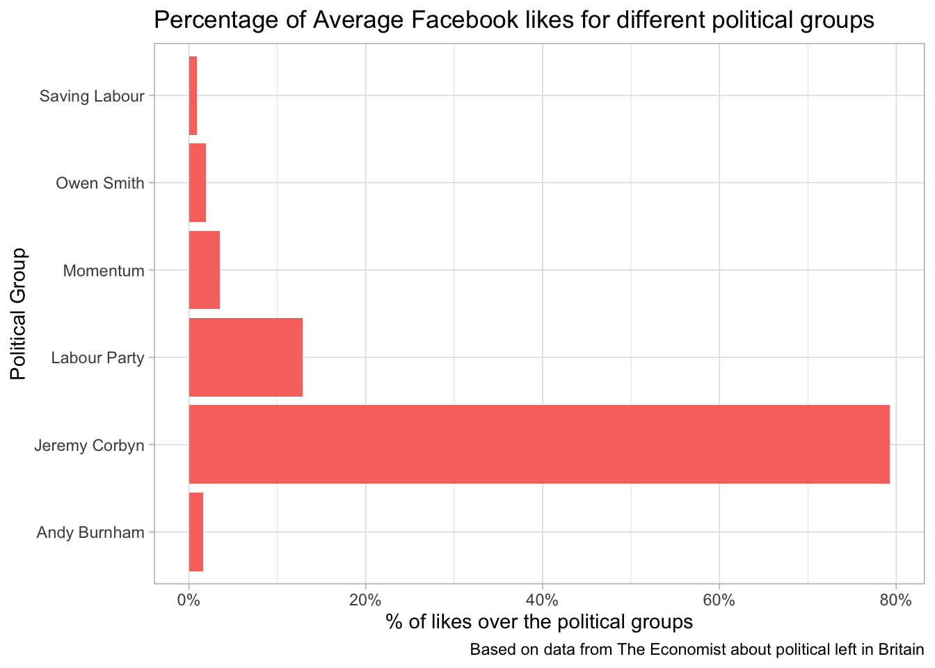
Analyzing decline of dog weights
dogs <- readr::read_csv("https://raw.githubusercontent.com/rfordatascience/tidytuesday/master/data/2019/2019-04-16/dogs.csv")

dogs
## # A tibble: 10 x 3
## year avg_weight avg_neck
## <dbl> <dbl> <dbl>
## 1 2006 20.5 44.3
## 2 2007 20.0 43.8
## 3 2008 19.4 43.4
## 4 2009 19.2 43.2
## 5 2010 19.1 43.2
## 6 2011 19.0 43.1
## 7 2012 18.6 42.8
## 8 2013 18.5 42.8
## 9 2014 18.4 42.7
## 10 2015 18.1 42.5dogs %>%
mutate(year = as.factor(year),
weight_to_neck = avg_weight/avg_neck) %>%
ggplot(aes(x = year, y = weight_to_neck)) +
geom_line(aes(group = 1)) +
geom_point() +
labs(x = "Year",
y = "Average Weight to Average Neck Ratio",
title = "Average Weight to Neck Ratio over Years",
caption = "Based on data from The Economist")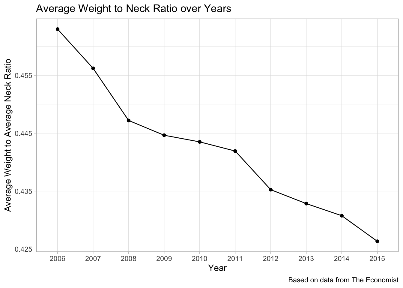
Analyzing Brexit data
brexit <- readr::read_csv("https://raw.githubusercontent.com/rfordatascience/tidytuesday/master/data/2019/2019-04-16/brexit.csv")

brexit
## # A tibble: 85 x 3
## date percent_responding_right percent_responding_wrong
## <chr> <dbl> <dbl>
## 1 02/08/16 46 42
## 2 09/08/16 45 44
## 3 17/08/16 46 43
## 4 23/08/16 45 43
## 5 31/08/16 47 44
## 6 14/09/16 46 43
## 7 12/10/16 45 44
## 8 20/10/16 45 44
## 9 15/11/16 46 43
## 10 29/11/16 44 45
## # … with 75 more rowsbrexit %>%
mutate(date = dmy(date)) %>%
ggplot(aes(x = date)) +
geom_smooth(aes(y = percent_responding_right, colour = "percent_responding_right"), se = FALSE) +
geom_point(aes(y = percent_responding_right, colour = "percent_responding_right")) +
geom_smooth(aes(y = percent_responding_wrong, colour = "percent_responding_wrong"), se = FALSE) +
geom_point(aes(y = percent_responding_wrong, colour = "percent_responding_wrong")) +
scale_color_manual(labels = c("Right", "Wrong"), values = c("blue", "red")) +
labs(x = "Date",
y = "Response Percentage",
title = "Response behaviour of people about Brexit over time on the question",
subtitle = "In hindsight, do you think Britain was right or wrong to vote to leave the EU?",
caption = "Based on data from The Economist",
color = "Response")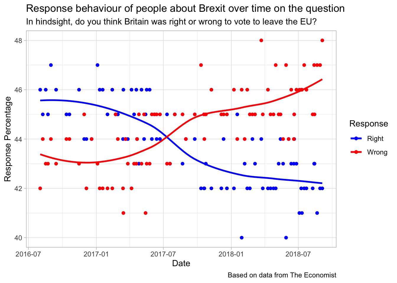
Analyzing US trade deficit
trade <- readr::read_csv("https://raw.githubusercontent.com/rfordatascience/tidytuesday/master/data/2019/2019-04-16/trade.csv")

trade
## # A tibble: 22 x 3
## year trade_deficit manufacture_employment
## <dbl> <dbl> <dbl>
## 1 1995 -3.38e10 17244583.
## 2 1996 -3.95e10 17236750
## 3 1997 -4.97e10 17417833.
## 4 1998 -5.69e10 17560000
## 5 1999 -6.87e10 17322667.
## 6 2000 -8.38e10 17265250
## 7 2001 -8.31e10 16440583.
## 8 2002 -1.03e11 15256833.
## 9 2003 -1.24e11 14508500
## 10 2004 -1.62e11 14314750
## # … with 12 more rowstrade %>%
mutate(year = as.factor(year),
trade_deficit = trade_deficit/1000000000,
manufacture_employment = manufacture_employment/1000000) -> trade
trade %>%
ggplot(aes(x = year, y = trade_deficit, fill = "trade_deficit")) +
geom_col(show.legend = FALSE) +
theme(axis.text.x = element_text(angle = 90, hjust = 1)) +
labs(x = "Year",
y = "Trade Deficit in billions",
title = "US Trade Deficit over years",
caption = "Based on data from The Economist") -> p1
trade %>%
ggplot(aes(x = year, y = manufacture_employment, color = "manufacture_employment")) +
geom_line(aes(group = 1), show.legend = FALSE) +
geom_point(show.legend = FALSE) +
theme(axis.text.x = element_text(angle = 90, hjust = 1)) +
labs(x = "Year",
y = "Manufacturing Employment in millions",
title = "Manufacturing Employment over years",
caption = "Based on data from The Economist") -> p2
grid.arrange(p1, p2, nrow = 1)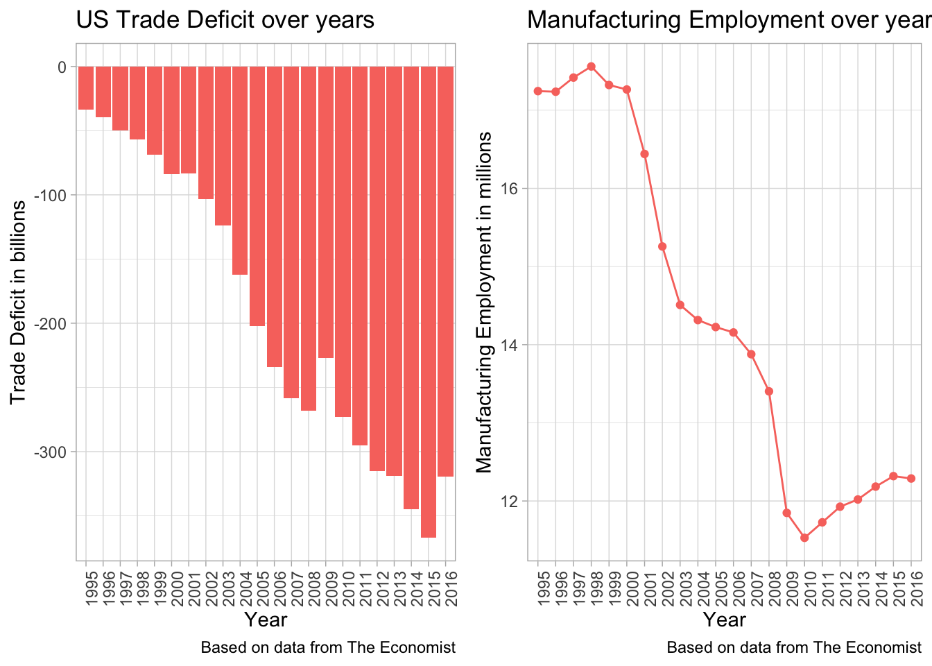
Analyzing pension benefits
pensions <- readr::read_csv("https://raw.githubusercontent.com/rfordatascience/tidytuesday/master/data/2019/2019-04-16/pensions.csv")

pensions
## # A tibble: 35 x 3
## country pop_65_percent gov_spend_percent_gdp
## <chr> <dbl> <dbl>
## 1 Australia 15.0 5.2
## 2 Austria 18.8 13.9
## 3 Belgium 18.2 10.4
## 4 Brazil 7.84 12
## 5 Canada 16.1 4.31
## 6 Chile 11 3.25
## 7 Czech Republic 18.1 9.09
## 8 Denmark 19.0 8.45
## 9 Estonia 18.8 6.99
## 10 Finland 20.5 11.4
## # … with 25 more rowspensions %>%
mutate(spend_per_head = gov_spend_percent_gdp/pop_65_percent) %>%
ggplot(aes(x = pop_65_percent, y = gov_spend_percent_gdp, color = country, size = spend_per_head)) +
geom_point(show.legend = FALSE) +
geom_text(aes(label = country), hjust = -0.15, vjust = 0, show.legend = FALSE) +
labs(x = "Percent of population aged 65 or older",
y = "Percent of government spending on pension benefits as percent of GDP",
title = "Government Spend vs. Population over 65",
subtitle = "Size of point represents the spend per head",
caption = "Based on data from The Economist")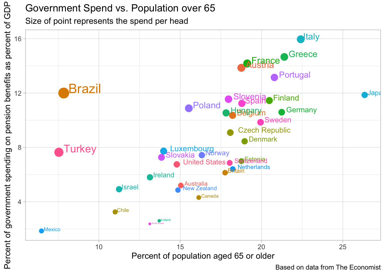
Analyzing EU balance
eu_balance <- readr::read_csv("https://raw.githubusercontent.com/rfordatascience/tidytuesday/master/data/2019/2019-04-16/eu_balance.csv")

eu_balance
## # A tibble: 266 x 4
## country account_type year value
## <chr> <chr> <dbl> <dbl>
## 1 Belgium current 2009 -3755
## 2 Germany current 2009 141234
## 3 Estonia current 2009 360
## 4 Ireland current 2009 -7912.
## 5 Greece current 2009 -29323
## 6 Spain current 2009 -46191
## 7 France current 2009 -10652
## 8 Italy current 2009 -29717
## 9 Cyprus current 2009 -1431
## 10 Latvia current 2009 1463
## # … with 256 more rowseu_balance %>%
mutate(year = as.factor(year),
account_type = as.factor(account_type),
country = as.factor(country)) %>%
group_by(year, account_type) %>%
mutate(perc = value/sum(value)) %>%
top_n(5, perc) %>%
ungroup() %>%
ggplot(aes(x = year, y = value, fill = country)) +
geom_col() +
facet_wrap(~account_type) +
labs(x = "Year",
y = "Value in billions of euros",
title = "Top 5 countries per year and account type",
subtitle = "Based on percentage of balances",
caption = "Based on data from The Economist")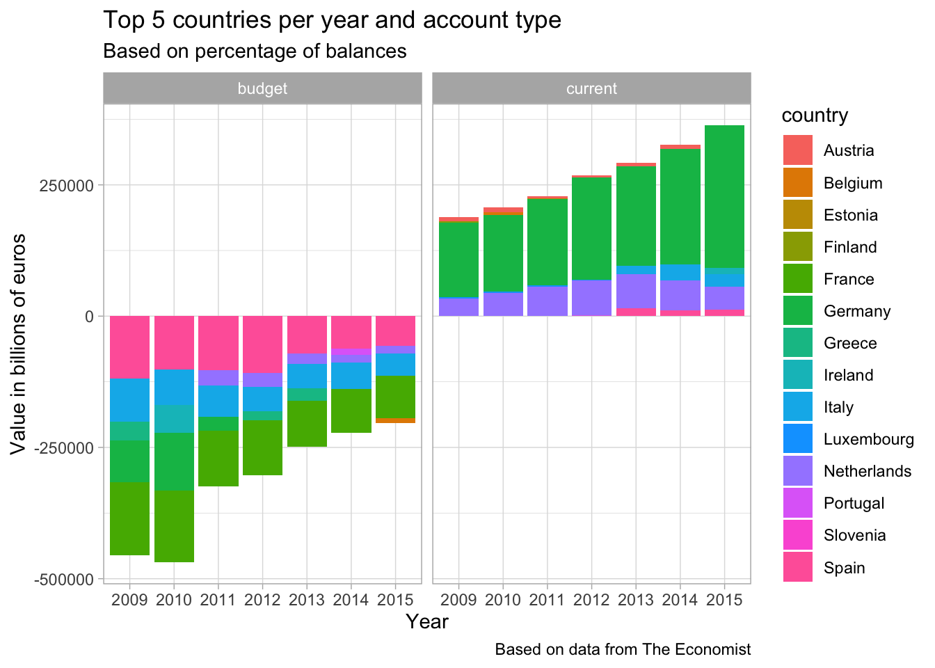
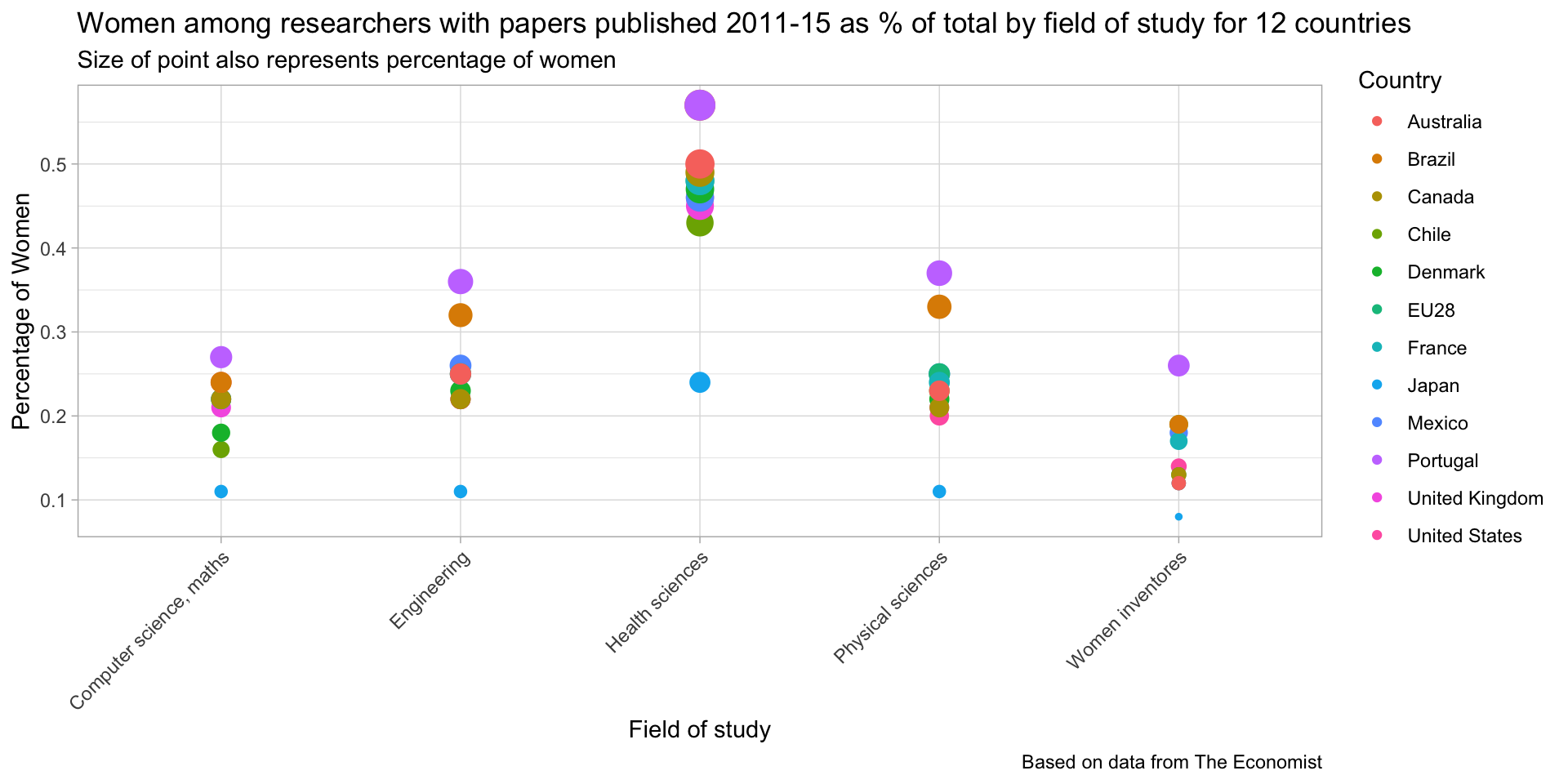
Analyzing papers published
women_research <- readr::read_csv("https://raw.githubusercontent.com/rfordatascience/tidytuesday/master/data/2019/2019-04-16/women_research.csv")

women_research
## # A tibble: 60 x 3
## country field percent_women
## <chr> <chr> <dbl>
## 1 Japan Health sciences 0.24
## 2 Chile Health sciences 0.43
## 3 United Kingdom Health sciences 0.45
## 4 United States Health sciences 0.46
## 5 Mexico Health sciences 0.46
## 6 Denmark Health sciences 0.47
## 7 EU28 Health sciences 0.48
## 8 France Health sciences 0.48
## 9 Canada Health sciences 0.49
## 10 Australia Health sciences 0.5
## # … with 50 more rowswomen_research %>%
ggplot(aes(x = field, y = percent_women, color = country, size = percent_women)) +
geom_point() +
scale_size(guide = "none") +
theme(axis.text.x = element_text(angle = 45, hjust = 1)) +
labs(x = "Field of study",
y = "Percentage of Women",
title = "Women among researchers with papers published 2011-15 as % of total by field of study for 12 countries",
subtitle = "Size of point also represents percentage of women",
color = "Country",
caption = "Based on data from The Economist")