
Introduction
In this NLP getting started challenge on kaggle, we are given tweets which are classified as 1 if they are about real disasters and 0 if not. The goal is to predict given the text of the tweets and some other metadata about the tweet, if its about a real disaster or not.
In this part 3 for Linear Modelling, I will use the processed data generated in Part 1 to train logistic regression based model with regularization in order to predict if a tweet is about a real disaster or not using the tidymodels framework. Following up from the previous Part 2 about Nearest Neighbors model, I will do a comparative study among these 2 modelling algorithms.
Analysis
Load Libraries
rm(list = ls())
library(tidyverse)
library(ggplot2)
library(tidymodels)
library(glmnet)
library(vip)
library(silgelib)

theme_set(theme_plex())
Loading processed data from previous part
tweets <- readRDS("../data/nlp_with_disaster_tweets/tweets_proc.rds")
tweets_final <- readRDS("../data/nlp_with_disaster_tweets/tweets_test_proc.rds")
tweets %>%
dim## [1] 7613 830tweets_final %>%
dim## [1] 3263 829Feature preprocessing and engineering
I will use the same steps of feature preprocessing and engineering from Part 2 here, in order to have an apples to apples comparison of the 2 models.
tweets %>%
  mutate(target = as.factor(target),
         id = as.character(id)) -> tweets

set.seed(42)
tweets_split <- initial_split(tweets, prop = 0.1, strata = target)

tweets_test <- training(tweets_split)
tweets_train_cv <- testing(tweets_split)

set.seed(42)
tweets_split <- initial_split(tweets_train_cv, prop = 7/9, strata = target)
tweets_train <- training(tweets_split)
tweets_cv <- testing(tweets_split)

recipe(target ~ ., data = tweets_train) %>%
  update_role(id, new_role = "ID") %>%
  step_rm(location, keyword) %>%
  step_mutate(len = str_length(text),
              num_hashtags = str_count(text, "#")) %>%
  step_rm(text) %>%
  step_zv(all_numeric(), -all_outcomes()) %>%
  step_normalize(all_numeric(), -all_outcomes())  %>%
  step_pca(all_predictors(), -len, -num_hashtags, threshold = 0.80)-> tweets_recipe

tweets_prep <- tweets_recipe %>%
  prep(training = tweets_train,
       strings_as_factors = FALSE)
Modelling
Lasso Regression using glmnet
Let’s build a basic logistic regression model with some default value of regularization penalty.
Basic
lasso_spec <- logistic_reg(penalty = 0.1, mixture = 1) %>%
  set_engine("glmnet") %>%
  set_mode("classification")

wf <- workflow() %>%
  add_recipe(tweets_recipe)
lasso_fit <- wf %>%
add_model(lasso_spec) %>%
fit(data = tweets_train)
saveRDS(lasso_fit, "../data/nlp_with_disaster_tweets/glmnet/lasso_basic_fit.rds")lasso_fit <- readRDS("../data/nlp_with_disaster_tweets/glmnet/lasso_basic_fit.rds")
lasso_fit %>%
pull_workflow_fit() %>%
tidy() ## # A tibble: 11,684 x 5
## term step estimate lambda dev.ratio
## <chr> <dbl> <dbl> <dbl> <dbl>
## 1 (Intercept) 1 -0.283 0.151 1.80e-14
## 2 (Intercept) 2 -0.284 0.138 1.17e- 2
## 3 PC001 2 -0.0101 0.138 1.17e- 2
## 4 (Intercept) 3 -0.284 0.126 2.14e- 2
## 5 PC001 3 -0.0194 0.126 2.14e- 2
## 6 (Intercept) 4 -0.285 0.114 2.97e- 2
## 7 PC001 4 -0.0280 0.114 2.97e- 2
## 8 (Intercept) 5 -0.286 0.104 3.66e- 2
## 9 PC001 5 -0.0360 0.104 3.66e- 2
## 10 (Intercept) 6 -0.288 0.0951 5.21e- 2
## # … with 11,674 more rowsAbove we see the familiar output of glmnet. Now, Let’s try and tune the regularization penalty and visualize the results.
Tuning lasso penalty
Using 10-fold cross validation and a few different values of regularization penalty.
set.seed(1234)
folds <- vfold_cv(tweets_train, strata = target, v = 10, repeats = 3)

tune_spec <- logistic_reg(penalty = tune(), mixture = 1) %>%
  set_mode("classification") %>%
  set_engine("glmnet")

lambda_grid <- grid_regular(penalty(), levels = 75)
doParallel::registerDoParallel(cores = parallel::detectCores(logical = FALSE))
set.seed(1234)
lasso_grid <- tune_grid(
wf %>% add_model(tune_spec),
resamples = folds,
grid = lambda_grid,
metrics = metric_set(accuracy, roc_auc, f_meas),
control = control_grid(save_pred = TRUE,
verbose = TRUE)
)
saveRDS(lasso_grid, "../data/nlp_with_disaster_tweets/glmnet/lasso_grid.rds")lasso_grid <- readRDS("../data/nlp_with_disaster_tweets/glmnet/lasso_grid.rds")
lasso_grid %>%
collect_metrics()## # A tibble: 225 x 6
## penalty .metric .estimator mean n std_err
## <dbl> <chr> <chr> <dbl> <int> <dbl>
## 1 1.00e-10 accuracy binary 0.772 30 0.00343
## 2 1.00e-10 f_meas binary 0.807 30 0.00277
## 3 1.00e-10 roc_auc binary 0.836 30 0.00370
## 4 1.37e-10 accuracy binary 0.772 30 0.00343
## 5 1.37e-10 f_meas binary 0.807 30 0.00277
## 6 1.37e-10 roc_auc binary 0.836 30 0.00370
## 7 1.86e-10 accuracy binary 0.772 30 0.00343
## 8 1.86e-10 f_meas binary 0.807 30 0.00277
## 9 1.86e-10 roc_auc binary 0.836 30 0.00370
## 10 2.54e-10 accuracy binary 0.772 30 0.00343
## # … with 215 more rowslasso_grid %>%
collect_metrics() %>%
mutate(flexibility = 1/penalty,
.metric = str_to_title(str_replace_all(.metric, "_", " "))) %>%
ggplot(aes(flexibility, mean, color = .metric)) +
geom_errorbar(aes(ymin = mean - std_err,
ymax = mean + std_err), alpha = 0.5) +
geom_line(size = 1.5) +
facet_wrap(~.metric, scales = "free", nrow = 3) +
scale_x_log10() +
theme(legend.position = "none") +
labs(title = "Model performance against model flexibility",
subtitle = "F1-score peaks around lower flexibility values",
x = "Model flexibility i.e. Log(1/penalty)",
y = "Mean metric value")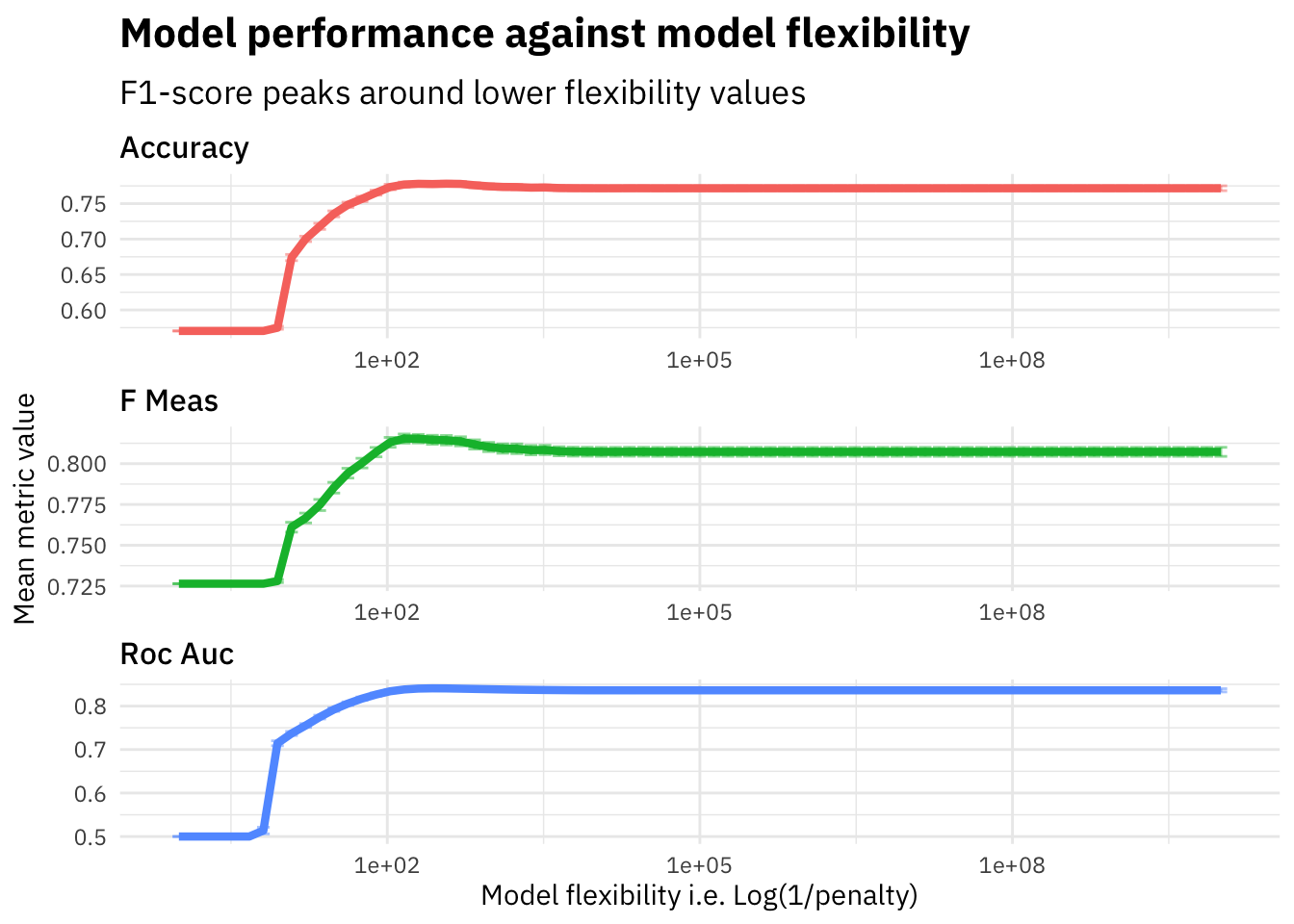 As we see in the plot above, the f1-score increases on the evaluation set until around penalty=0.005 and then starts falling down. We plot the flexibility (i.e. 1/penalty) to visualize how the model performance varies as the model flexibility increases. The Lasso Regression model with a lower penalty value will be highly flexible since it will not penalize the features weights by a lot and thus have high variance, whereas a higher penalty would lead to a much stricter model which is less flexible since a lot of feature weights will be moved to zero due to high penalty and therefore the model might suffer from bias.
Let’s pickout the best parameter penalty based on the highest f1-score and train our final model on the full training dataset and evaluate against cross validation dataset.
lasso_grid %>%
  select_best("f_meas") -> highest_f_meas

final_lasso <- finalize_workflow(
  wf %>% add_model(tune_spec),
  highest_f_meas
)
last_fit(final_lasso,
tweets_split,
metrics = metric_set(accuracy, roc_auc, f_meas)) -> lasso_last_fit
saveRDS(lasso_last_fit, "../data/nlp_with_disaster_tweets/glmnet/lasso_last_fit.rds")lasso_last_fit <- readRDS("../data/nlp_with_disaster_tweets/glmnet/lasso_last_fit.rds")
lasso_last_fit %>%
collect_metrics()## # A tibble: 3 x 3
## .metric .estimator .estimate
## <chr> <chr> <dbl>
## 1 accuracy binary 0.763
## 2 f_meas binary 0.806
## 3 roc_auc binary 0.826The f1-score metric on the validation set comes out to be 0.8058252 which is much higher compared to the baseline and also the K-Nearest Neighbor model that we built in Part 2. Lets try and visualize the variable importance for different features that we used to train our model.
lasso_last_fit$.workflow[[1]] %>%
  pull_workflow_fit() %>%
  vi(lambda = highest_f_meas$penalty) %>%
  mutate(Importance = abs(Importance),
         Variable = fct_reorder(Variable, Importance)) %>%
  top_n(10, Importance) %>%
  ggplot(aes(x = Importance, y = Variable, fill = Sign)) +
  geom_col() +
  scale_x_continuous(expand = c(0,0)) +
  labs(y = NULL,
       x = "Importance",
       title = "Variable Importance plot",
       subtitle = "'len' feature has high positive impact on disaster probability")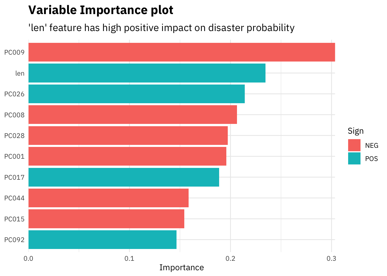
Since most of our features are the dimensionally reduced different dimensions coming out of the glove embeddings, we can not interpret them. However, as in the plot above, our custom feature “len” i.e. length of the tweets comes out as one of the most important features. The model gives a higher probability of a tweet being about a disaster if its longer in length, signifying that people tweeting about real disasters usually use a lot more words as compared to others.
Let’s visualize how the coefficient estimates vary based on lambda for our 2 custom features, length of tweets and number of hashtags, and also for 1 other high coefficient feature in both positive and negative directions each.
lasso_last_fit$.workflow[[1]] %>%
  pull_workflow_fit() %>%
  tidy() %>%
  filter(term %in% c("len", "num_hashtags", "PC009", "PC026")) %>%
  select(term, estimate, lambda) %>%
  pivot_wider(names_from = term, values_from = estimate) %>%
  replace_na(list(num_hashtags = 0, PC009 = 0, len = 0, PC026 = 0)) %>%
  pivot_longer(names_to = "term", values_to = "estimate", cols = -lambda) %>%
  ggplot(aes(x = lambda, y = estimate, color = term)) +
  geom_point() +
  geom_line() +
  geom_abline(slope = 0, intercept = 0, linetype = 2,
            color = 'grey50') +
  scale_x_log10() +
  labs(x = "Log (Penalty Parameter) ",
       y = "Coefficient Estimate",
       color = "Feature",
       title = "Feature coefficients against penalty parameter",
       subtitle = "'num_hashtags' feature gets to zero coefficient very soon in comparison")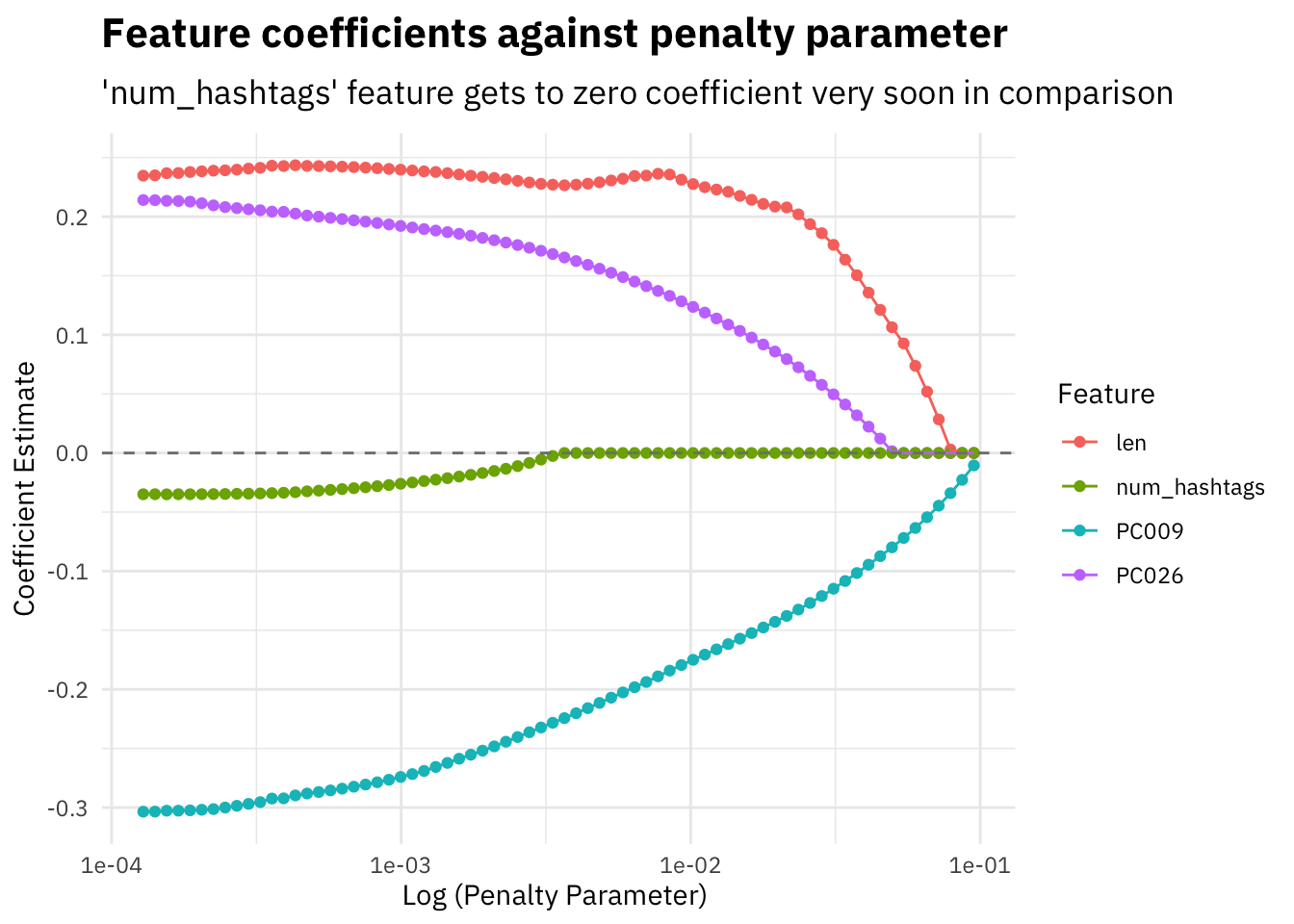
All feature coefficients tend to move towards zero as we increase the lambda penalty parameter, some more quickly than others.
Model Calibration
Another method to measure model performance is to see how well calibrated a model is on the validation dataset. Let’s compare our 2 models, lasso regression here and the best k-nearest neighbor model from Part 2, by plotting calibration plots for each of them.
readRDS("../data/nlp_with_disaster_tweets/knn/knn_last_fit.rds") %>%
  collect_predictions() %>%
  mutate(pred_bucket = as.integer(`.pred_1`/(1/11))) %>%
  group_by(pred_bucket) %>%
  summarise(mean_truth = mean(as.numeric(as.character(target)))*100,
            mean_pred = mean(`.pred_1`)*100) %>%
  ungroup() %>%
  ggplot(aes(x = mean_pred, y = mean_truth)) +
  geom_point(color = "#F8766D", size = 3) +
  geom_line(color = "#F8766D") +
  scale_x_continuous(limits = c(0, 100)) +
  scale_y_continuous(limits = c(0, 100)) +
  geom_abline(slope = 1, intercept = 0, linetype = 2,
            color = 'grey50') +
  labs(x = "Mean True Prediction",
       y = "Mean Truth",
       title = "Calibration Plot for K-nearest neighbors model",
       subtitle = "Above the diagonal signifies under-forecast")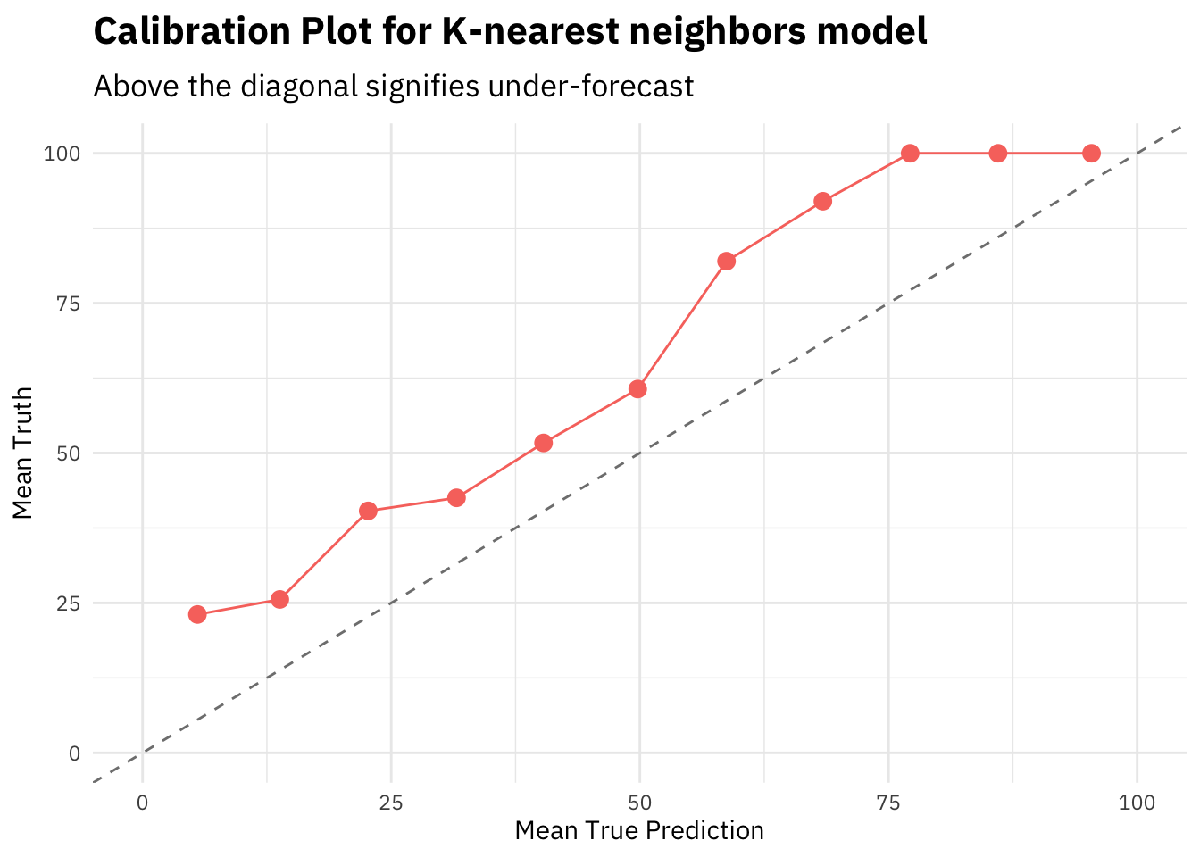
lasso_last_fit %>%
  collect_predictions() %>%
  mutate(pred_bucket = as.integer(`.pred_1`/(1/11))) %>%
  group_by(pred_bucket) %>%
  summarise(mean_truth = mean(as.numeric(as.character(target)))*100,
            mean_pred = mean(`.pred_1`)*100) %>%
  ungroup() %>%
  ggplot(aes(x = mean_pred, y = mean_truth)) +
  geom_point(color = "#F8766D", size = 3) +
  geom_line(color = "#F8766D") +
  scale_x_continuous(limits = c(0, 100)) +
  scale_y_continuous(limits = c(0, 100)) +
  geom_abline(slope = 1, intercept = 0, linetype = 2,
            color = 'grey50') +
  labs(x = "Mean True Prediction",
       y = "Mean Truth",
       title = "Calibration Plot for Lasso Regression model",
       subtitle = "Close to the diagonal signifies well calibrated model")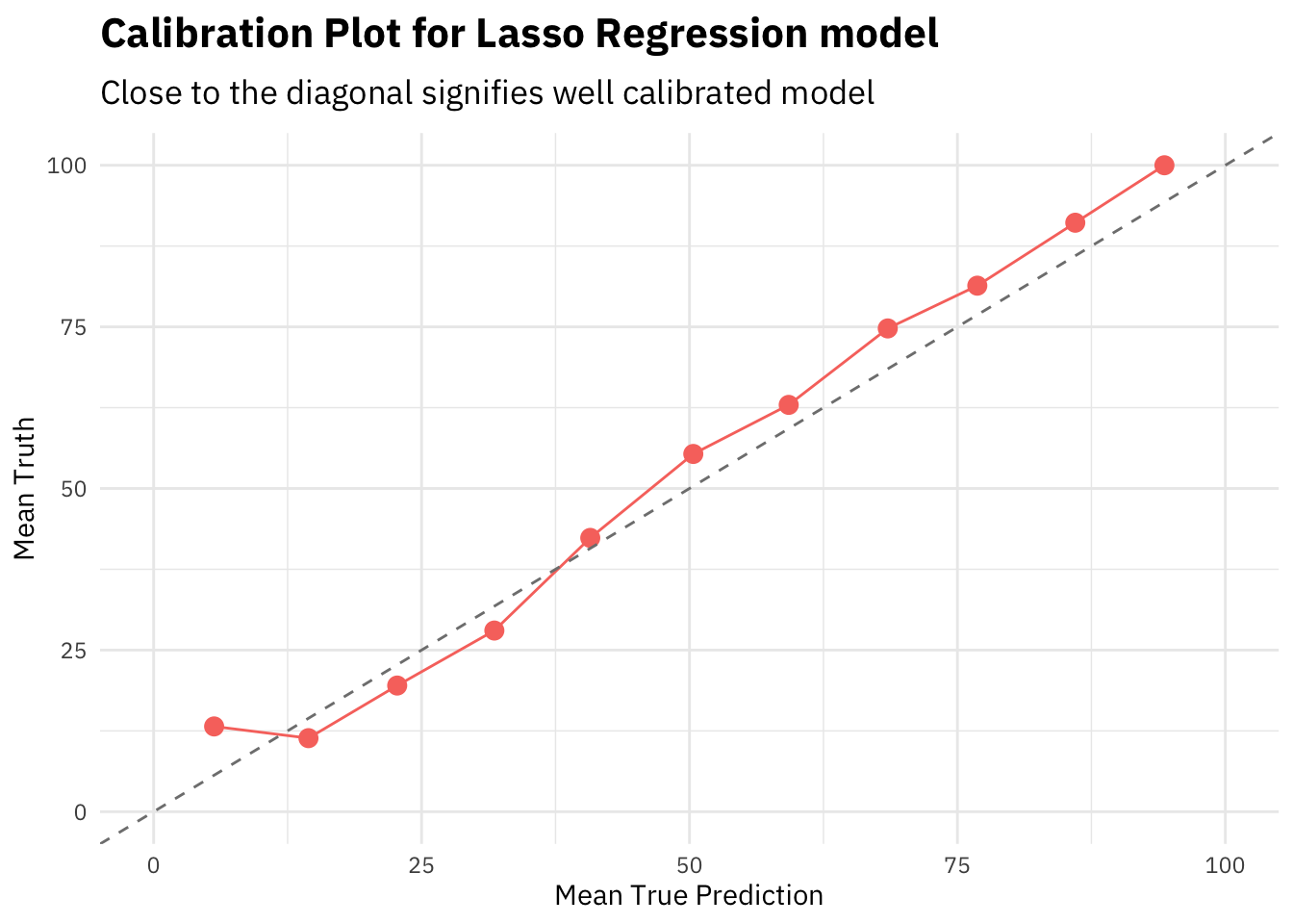
In general, closer the calibration curve to the diagonal, the better. When a model is well calibrated, the mean prediction probability will be equal to mean truth. Meaning the model is predicting the target in the same ratios as the actual truth values.
The KNN model calibration plot shows that the curve is above the diagonal, i.e. the model is frequently under estimating the predicted probabilities.
However, the lasso regression seems to be well calibrated out of the box. That’s a sign of good stable algorithm and training procedure.
Note that all the predicted probabilities here are calculated on the cross validation set.
Summary
In the next part of this series, I will start building models with a different class of function space, like piece-wise constant functions and linear combination of piece-wise constant functions classes i.e. simple decision trees and gradient boosted trees respectively. As we see in this blog post that the class of linear functions do give better performing models and we learnt our problem space to be leaning towards flexible models in Part 2, I expect to see better results for different, more flexible modelling approaches.
References
- Project Summary Page - NLP with disaster tweets: Summary
- Project Part 1 - NLP with Disaster Tweets: Part 1 Data Preparation
- Project Part 2 - NLP with Disaster Tweets: Part 2 Nearest Neighbor Models
- Lasso Regression using Tidymodels by Julia Silge.
- Introduction to Statistical Learning - Book